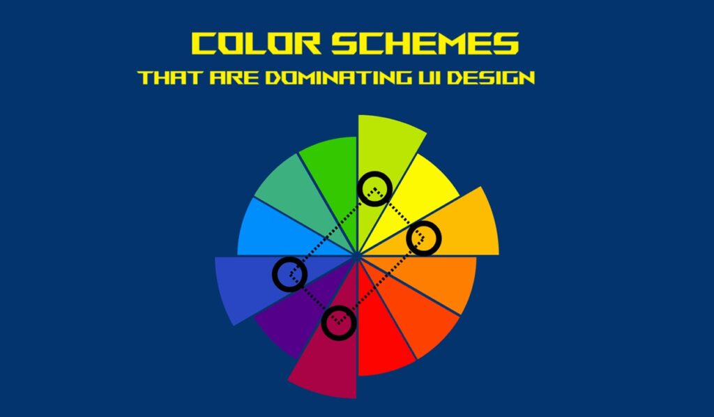
5 Color Schemes That Are Dominating UI Design in 2025
Color has always played a pivotal role when it comes to UI design. It largely influences one’s mood, highlights function, & likely creates an emotional connection between users & the product. As we cruise through 2025, we are witnessing some very interesting shifts in how designers are using color—not just for the purpose of aesthetics but also for accessibility, branding, & psychological impact.
From serene pastels to the most futuristic dark blends, today’s trending palettes are redefining what it means to make digital experiences both beautiful as well as functional at the same time. If you are working on a redesign or just love keeping up with the existing UI trends, here is a detailed discussion about the five color schemes that are dominating UI design in 2025.
Table of Contents
- 1 1. Digital Lavender & Serene Pastels
- 2 2. Neo-Neutral Earth Tones
- 3 3. High Contrast Futuristic Dark Mode
- 4 4. Vibrant Monochrome with a Pop
- 5 Where It’s Being Used:
- 6 5. Retro Tech Revival: 90s & Y2K-Inspired Palettes
- 7 Honorable Mentions: Other Color Trends That Are Worth Noticing
- 8 How to Choose the Right Color Scheme for Your UI?
- 9 Final Thoughts: Stay Ahead with Evolving UI Color Trends
- 10 Want More Fresh UI/UX Trends?
1. Digital Lavender & Serene Pastels
Soft, calm, & emotionally intelligent—2025 is the year of digital serenity.
Digital lavender, a futuristic soft purple with certain bluish undertones, has largely emerged as the poster child of calm tech. Inspired by wellness trends & the growing need for digital detox, this shade blends beautifully with mint green, soft peach, & pale sky blue to form soothing pastel palettes.
Why It Works:
- It offers a calming visual experience for several users who spend long hours on screens.
- Evokes feelings of safety & comfort—great for productivity tools, wellness apps, & mental health platforms.
- It adapts really well to both light as well as dark UI modes.
Where It’s Being Used:
- This color scheme is majorly used in mindfulness & meditation apps
- It is also perfect for remote work dashboards
- The same is suitable for various fintech platforms aiming for a friendly tone.
Pro Tip: You may opt to combine digital lavender with various smooth gradients & rounded edges for a soft-touch & futuristic interface.
2. Neo-Neutral Earth Tones
After several years of sleek minimalism, brands are usually getting more grounded. Earth-inspired palettes using color schemes like olive green, clay brown, sand beige, & terracotta are dominating UI across ecommerce, wellness, & sustainability-focused platforms.
This neo-neutral wave goes beyond just being “natural.” It strongly represents stability, warmth, & authenticity—something several users crave in the ever-digital world.
Why It Works:
- It evokes trust and a sense of grounded-ness.
- It pairs well with the most sustainable & eco-conscious brand narratives.
- It creates a warm, & inviting space in UIs otherwise perceived as cold or corporate.
Where It’s Being Used:
- It is most suitable for organic skincare brands
- It can be relevantly used in slow fashion e-commerce sites as well.
- It is a perfect choice for nature-inspired blogs & communities
Tip: Consider matte textures & minimalist iconography in order to receive the most out of this palette.
3. High Contrast Futuristic Dark Mode
Dark mode is no longer just an accessibility feature—it is a branding tool as well. In 2025, dark interfaces are being paired with several vibrant neon accents like electric blue, neon lime, cyber pink, & atomic tangerine.
This high-contrast scheme largely enhances visual depth, aids focus, & gives off serious sci-fi, cutting-edge vibes—especially in the various tech-forward applications.
Why It Works:
- It reduces eye strain in the low-light environments.
- It highlights call-to-actions & key UI elements very effectively.
- It adds a premium, & modern edge to your product.
Where It’s Being Used:
- It is a suitable choice for several developer tools & SaaS dashboards.
- It is also perfect for AI platforms & crypto wallets
- It is a good fit for night-themed or gamer-oriented apps
Tip: Avoid using too many bright neon at once—pick one or two accent colors in order to maintain visual clarity.
4. Vibrant Monochrome with a Pop
Think of a UI that that plays it safe—then throws in a bold surprise. That’s what the vibrant monochrome trend is all about.
Designers are leaning into single-color schemes (like shades of green or blue) & then breaking the monotony with a strategic pop—perhaps a fiery red button or a golden icon.
Why It Works:
- It offers a cohesive, & minimal aesthetic.
- Let the bold accent color guide user interaction.
- It creates visual hierarchy without overwhelming the user.
Where It’s Being Used:
- It is perfect for portfolio websites.
- It can be suitably used in personal blogs & resume pages.
- It is also used in Boutique SaaS products and start-ups.
Tip: Do you want to know the best use case? Use a bold pop color that very well highlights conversion points like “Sign Up” or “Try Now.”
5. Retro Tech Revival: 90s & Y2K-Inspired Palettes
Nostalgia is in hype and is big in 2025—& not just in fashion. UI designers are rightly reviving bold, energetic and interesting palettes that are inspired by 90s & early 2000s web design.
Think pixel blues, punchy purples, lime greens, & techno grays, often layered with shadows, gradients, & playful typography.
All of these schemes stand out for their emotional resonance & individuality. They remind users of a time when the internet was absolutely raw, exciting, & experimental.
Why It Works:
- It perfectly taps into millennial & Gen Z nostalgia.
- It breaks the mold of clean, corporate design.
- It adds personality & playfulness to the user experience
Where It’s Being Used:
- It is often being used on media & entertainment platforms.
- It is also perfect for various niche community apps.
- It can be used on music as well as lifestyle brands.
Tip: Balance the retro vibe with modern UI patterns for better usability.
Honorable Mentions: Other Color Trends That Are Worth Noticing
While the five color schemes above are very clearly in the spotlight and are very popularly being used, a few other trends are also bubbling up that deserve a huge shout out:
- Glassmorphism Gradients – This color trend represents frosty transparencies with gradient overlays. They are being very prevalently used.
- Tonal Minimalism – The usage of tonal variation, just 2–3 tonal variations keep things ultra-clean and is also into trend.
- Inclusive Color Design – These particular palettes are very well-optimized for colour-blind accessibility
These particular options may not be dominating yet, but you may keep them on your radar. They might shape the next wave of UI design innovation.
How to Choose the Right Color Scheme for Your UI?
While deciding on a color scheme for your digital product, do not just chase trends. Ask:
- What particular mood do I want to create?
- Who are my users, & how do they perceive color?
- Is accessibility a priority?
- Do these particular colors align with my brand values?
Color is not just decoration—it is also communication. The right palette speaks volumes without a single word.
Final Thoughts: Stay Ahead with Evolving UI Color Trends
Color trends in UI design are not just about visual appeal—they also primarily reflect cultural shifts, user expectations, & also technological evolution. The dominant color schemes of 2025 show us that users are craving a balance of clarity, calmness, individuality, & excitement.
No matter if you are a seasoned designer, a product manager, or just curious about design trends, keeping up with these shifts can give your next project an altogether cutting-edge advantage.
Want More Fresh UI/UX Trends?
We are constantly exploring what is next in the area of digital design—from fonts & layouts to animations & accessibility. Bookmark this page & check back regularly for more expert insights, color inspiration, & design trends you can actually use.
Until then, stay colorful—and design with purpose.