Basic Types of Screens for Mobile UI Design
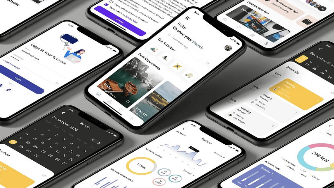
Let’s be honest – mobile apps are all about screens. Every tap, swipe, or scroll takes you to an altogether different screen. But did you ever wonder that how many types of screens a mobile app actually requires?
Well, if you are designing an app (or getting one designed), understanding the types of screens in mobile UI design is a must. Every screen has a unique purpose. Some welcome users, some guide them, and some keep them engaged.
So, grab your favorite drink & let us dive into this beginner-friendly guide to the various essential screens every mobile UI designer should necessarily know.
Table of Contents
- 1 Splash Screen (Also Referred to as the First Impression)
- 2 Onboarding Screens (Also Referred to as the Friendly Guide)
- 3 Home Screen (Also Referred to as The Main Hub)
- 4 Login & Signup Screens (Also Referred to as The Gatekeepers)
- 5 Profile Screen (Also Referred to as the Personal Space of the User)
- 6 Feed Screen (Meant for Scrolling & Exploring)
- 7 Search Screen (Finding What Matters)
- 8 Navigation Screen (Tabs & Menus)
- 9 Detail Screen (Zooming In)
- 10 Settings Screen (The Control Center)
- 11 Checkout Screen (Conversion Focused)
- 12 Notification Screen (Stay Connected)
- 13 Error and Empty States (Handle Gracefully)
- 14 Loading Screen (Be Patient, Nicely)
- 15 Quick Summary Table
- 16 Conclusion
Splash Screen (Also Referred to as the First Impression)

Let us start with the very first thing users see – the splash screen.
It is not merely a pretty-looking loading page. It is your brand’s first handshake. A splash screen usually displays your brand logo, brand colors, or a tagline. It appears just for a few seconds while the app loads in the background.
Purpose:
-
- Brand recall
- Creates a smooth loading experience
- Sets the entire tone of the app
Best Practices:
-
- Keep it short (3 seconds or less)
- Use animation sparingly
- Display your brand name or logo clearly
Onboarding Screens (Also Referred to as the Friendly Guide)

Onboarding screens are like helpful tour guides. They walk new users through the app and explain how things usually work.
You have seen them – those swipeable slides that say “Track your habits,” “set goals,” “Stay healthy,” & so on.
Types of Onboarding:
-
- Tutorial-style – Step-by-step instructions
- Benefit-oriented – Focus on what the app generally offers
- Permission-based – Ask for access (notifications, location)
Why It Matters:
-
- Helps first-time users feel confident
- Increase retention
- Reduce drop-offs
Useful Tip: Do not make it too long. Let users skip if they want to.
Home Screen (Also Referred to as The Main Hub)

The home screen is the heart of your app. It is the dashboard or language page where users spend most of their time.
Examples:
-
- A feed (like Instagram)
- A dashboard (like a fitness app)
- A list of services (like a food delivery app)
Key Features:
-
- Clean layout
- Easy navigation
- Visible CTAs (Call-to-Actions)
A good home screen should be very intuitive. It should necessarily answer the question: “What can I do here?”
Login & Signup Screens (Also Referred to as The Gatekeepers)

These particular screens are your entry points. Users can either sign up to create a new account or sign in into their existing account. And if you mess these up, you might lose users forever.
Design Tips:
-
- Keep forms short
- Use social login options (Apple, Google, Facebook)
- Clear error messages
- Easy password recovery
Useful Tip: Make users feel secure. Add subtle prompts like “Your data is safe with us.”
Profile Screen (Also Referred to as the Personal Space of the User)

This screen is where the users manage their personal info. The components of this page are profile pics, settings, preferences, & history.
A clean & editable profile screen helps users feel in control.
Must-Haves:
-
- Edit Profile
- Preferences/Settings
- Logout option
- Dark mode toggle (this one is optional but coo!)
Feed Screen (Meant for Scrolling & Exploring)
If your app is content-heavy, you need a feed screen for sure. Platforms like social apps, e-Commerce apps, & blogs are some of the examples where Feed screen is necessary.
Key Elements:
-
- Cards or lists of content
- Videos, images, buttons and titles
- Infinite pagination or scroll
You should ensure that the layout is visually pleasing and does not overwhelm at all.
Search Screen (Finding What Matters)

The search screen helps users to find what they are looking for quickly. It may also have filters, smart suggestions, or search bars.
What to Include:
-
- A search input field
- Popular or recent searches
- Categories or filters

Navigation is the backbone of user experience. These screens include tabs, bottom navigation bars, floating menus, or side drawers.
Common Types:
| Navigation Type | Where It Appears | Best For |
| Bottom Nav Bar | At the bottom | 3–5 main sections |
| Hamburger Menu | Left side drawer | Apps with many categories |
| Tab Bar | Top or bottom | Quick switching |
Make navigation consistent across screens. Do not confuse users.
Detail Screen (Zooming In)

When a user taps something in the feed, it usually opens the detail screen. It shows deeper info.
Examples:
-
- Product details in an e-Commerce app
- A blog post in a content app
- A full video or image view
Keep it informative, clear, & action-oriented (e.g. Like, Share, Buy Now)
Settings Screen (The Control Center)

Users love control. And the settings screen gives them just that.
Things You Can Include:
-
- Privacy options
- Notifications
- Account Settings
- Help & Support
This screen let users personalize their experience.
Checkout Screen (Conversion Focused)

For e-commerce or food apps, the checkout screen is where real action happens – the sale.
Make it:
-
- Simple & clean
- Transparent (no hidden charges/fees)
- Trust-building (use secure payment icons)
Avoid too many fields. Few steps = better conversions
Notification Screen (Stay Connected)

Apps often come with a notification screen that displays updates, reminders, or actions.
You Need to Ensure:
-
- Messages are clear
- Interactive (tap to view more)
- Time-stamped
Avoid overload. Let users control what they get notified about.
Error and Empty States (Handle Gracefully)

Things go wrong at times. Searches return no results. Internet drops. Something crashes.
This is where error & empty states come in.
Examples:
-
- “Oops! Something went wrong.”
- “No result found. Try something else.”
- “You have not added any items yet.”
Use friendly language, illustrations, & solutions. Help user recover smoothly.
Loading Screen (Be Patient, Nicely)

Sometimes things take a second to load. A simple loading screen or animation can make that wait feel less annoying.
Use loaders, skeleton screens, or fun animations in order to keep it light.
Quick Summary Table
| Screen Type | Purpose |
| Splash | Brand intro |
| Onboarding | Guide new users to the platform |
| Home | Main dashboard |
| Login/Signup | Access gate to more content and solutions |
| Profile | Personal data can be entered and managed |
| Feed | Browse content as per the user’s choice |
| Search | Find stuff fast |
| Navigation | Move around easily |
| Detail | View item details |
| Settings | Customize app as per given options |
| Checkout | Confirm and pay |
| Notification | Get updates |
| Error/Empty States | Handle problems smoothly and seamlessly |
| Loading | Show wait-time feedback |
Conclusion
Designing a mobile app is not merely about how it looks. It is about making every screen work hard – to guide, inform, delight, & convert users.
In case you are building an app or planning to design one, knowing these types of mobile UI screens will help you considerably and you will be able to think like a pro.
Are you interested in more information regarding designing intuitive screens for your mobile app? Keep an eye on this page for more updates.