Color Psychology: The Logo Color Tricks Used by Top Companies—and How to Design Your Own
When you think about top brands like Facebook or Apple, you surely have a specific picture in your mind. This is how a good logo works! Being a brand representative, it holds much symbolism that represents the company’s various aspects.
The very first thing that you would notice is the logo’s color. Every single hue and tone can say a lot about the brand. Let’s try to discover the psychology behind the color for business branding purposes.
Table of Contents
Logo Color and Brand Identity
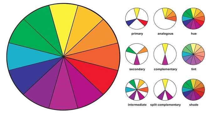
![]()
The association between color and brand identity is strong. Similar to a carefully chosen brand name, color has an intrinsic meaning that becomes crucial to business representation in the industry. It enables the company’s better recognition by introducing the desired image to the audience.
You might have noticed that every industry has prevailing colors. For example, more than 70% of IT companies use blue color on their logos, while telecommunication companies are more into a black trend.
When you are about to choose your color palette, you should analyze your industry first. People subconsciously get some emotional responses to companies, depending on the colors they use. For consumers confronted with advertising every single day, the visual clues can bring messages about what they’re offered.
Color Psychology and Logos
When it comes to logo colors, you can hardly avoid the topic of color psychology. After all, the color choice depends on human responses to certain hues. For example, yellow is usually associated with something bright, light, and honest. However, you shouldn’t ignore the context. If you place yellow next to orange, you might trigger the opposite effect. Moreover, colors are perceived in different ways, depending on consumers’ age, social status, nationality, religion, and so on.
As you can see, color psychology isn’t all about black and white. No color can guarantee you a 100% positive result for your business brand. But it can guarantee strong associations in the mind of consumers.
Industry Design Principles
Logo design turns out to be a serious dilemma. You want a logo to stand out from the crowd. At the same time, you have to follow universal design principles. Have you ever thought that red is the most commonly used color in the food industry? That’s because it stands for passion, desire, and hunger. Thus, every logo color has a chain of associations.
In the creative process, you should use universal principles as a starting point. There is nothing bad about being different. But it shouldn’t look like an awkward accident. If you decide to break the rules, make thought-out choices that contribute to your story.
Brand Personality and Values
Judging a book by its cover is not a good idea. But it can make your creative choice easier when you are working on a business image. In the beginning, you can make up a list of features, emotions, and actions to describe your brand personality. Is your company democratic? Customer-friendly? Expensive?
Innovative? Smart? Elegant?
Take a look at the LinkedIn logo for inspiration. It combines the seriousness and confidence of black, blue, and white colors. The entire logo image looks incredibly sophisticated.
Brand Positioning
Color choices determine your position in the industry by putting it in the opposition to other brands. After all, different companies can sell similar brand products and have little to nothing in common.
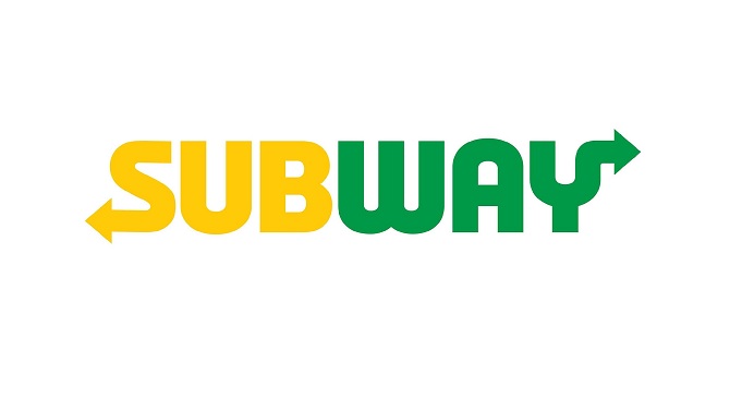
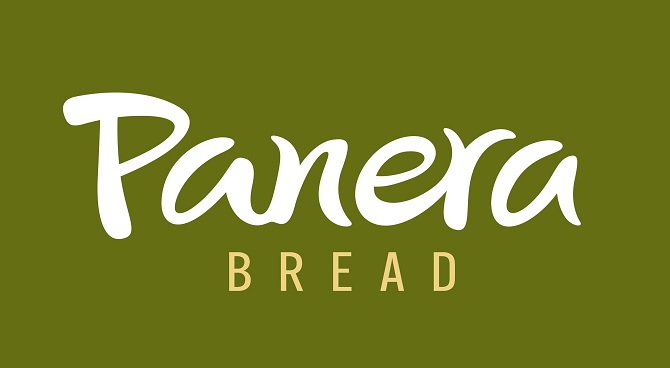
Just think of the differences between the well-known facilities like Subway and Panera Bread. Their logos are designed in a green color to represent fresh food. However, the Subway logo also appeals to the brand’s fast service and cheerful promotion campaigns. When you conduct some research and analysis, you will see that Subway aims to position itself as a fun, fresh, and cheap facility. Meanwhile, the Panera Bread logo is based on a different concept. The combination of earthy colors reflects on a friendly, wholesome restaurant with house-made bread and organic ingredients.
Color Psychology by Popular Brands
The most popular brands don’t just randomly decide on a logo color they would like to use for their corporate image. When it comes to business identity, there is a reason for literally everything. They want to convey a certain message to potential customers and they know that the right colors will make this possible. Let’s take a look at some popular brands to see how they share their idea with the world.
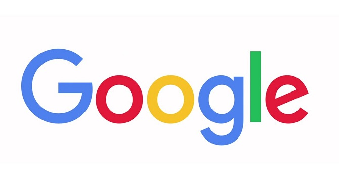
Google happens to be a rare exception to the standard rule saying that a fortune of colors can harm your brand image and even damage brand recognition.
The Google logo features four primary colors. According to Ruth Kedar, a marketing designer, the company has made this unpopular choice on purpose to stand out from the crowd.
Coca-Cola
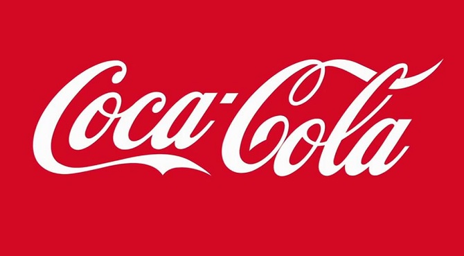
Coca-Cola has the reason for using predominantly red on its business logo. From the first day of the company’s operations, barrels containing Coca-Cola were painted red. This way, tax agents could distinguish them from alcohol barrels during transportation. Eventually, the popular color has become a visit card of Coca-Cola and a universal trend.
Toyota
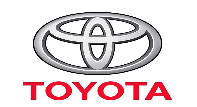
To convey its passionate spirit, Toyota chooses red color on its logo. In addition, the company uses black, white, and grey to highlight the primary color. The used combination is simple yet effective. It can create a sense of urgency when a customer is looking at Toyota’s cars.
How to Choose a Logo Color?
Your logo should become a source of inspiration for potential customers. This is why you should invest all your creativity into its visual image. Don’t be afraid to play with different logo colors before making your final decision. See what works and what doesn’t. Once you are satisfied with the result, you can share it with the world. To avoid the most common web design mistakes, we have shared some strategic steps to be taken on the way to the perfect logo.
-
- Clarify your brand position. What kind of message do you want to send to your customers? Does your company position itself as friendly? Informative? Provocative? These details will help you share your vision in the right way. For example, green can convey youth and freshness while blue can convey reliability and intelligence.
- Analyze your logo competition. Analyzing the color schemes can’t be effective without having a look at the industry trends. In other words, you should conduct some image research by checking your closest competitors. By knowing the current trends, you will be able to create something unique.
- Analyze your target audience. When you share brand personality with your target customer, you should realize the whole responsibility on your shoulders. Consumers consciously or subconsciously choose products that align with their personal preferences. Logo colors help consumers to differentiate products, identify the most suitable options, and choose between similar products.
- Select your logo type. Wordmarks and symbols are two major types of logos. A wordmark places the company’s name in the center of the logo. It mainly relies on a smooth typeface and strong color choice. A symbol focuses on iconography to turn the company into a well-recognizable brand.
- Translate the language of color. You should be familiar with the symbolic meanings of your logo colors. This is especially the case for international brands. For example, white is viewed as a source of purity and perfection in Western countries. However, it evokes an association with death in Eastern countries.
- Reach harmony between your logo style and overall composition. Let the style of your logo determine which and how many colors you use. Do not start messing with colors after you have already finalized a logo idea. Try to think of both the color and the design throughout the creative process. At Master Bundles, you may take the font, picture, and other elements for your logo. This website serves as a source of inspiration for many designers. By checking the latest trends, you will be able to wrap up everything into a single package.
In the business sphere, a logo and other corporate attributes are created for a long-term perspective. Being the permanent marker for your brand, your logo can’t be changed every month or every year. However, some slight updates are quite possible.
Once you know what and how you want to see your logo, you should check out the fortune of colors and identify which might help you create the proper visual content. The main point is to conduct thorough logo color research and make every single choice carefully.
Bottom Line
Choosing the color of your business logo is not as easy as one may assume. Considering a fortune of available options, making the right choice has become incredibly difficult. If you want to design your logo yourself, then you need to conduct thorough research. Consider how you want to create your brand’s identity and how you want to share that with your customers. Now that you have a general understanding of logo trends, it’s time for you to take action.